ShopDreamUp AI ArtDreamUp

Deviation Actions


Suggested Deviants


Suggested Collections


You Might Like…


Featured in Groups


Description
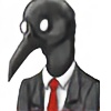
My second digital drawing. Please critique and comment, I'm still working on drawing digitally, and feedback would be much appreciated  (Wink)")
Thinking of making this an OC...though she doesn't have a name. any suggestions?
Created with Adobe Photoshop Elements 9.
Thinking of making this an OC...though she doesn't have a name. any suggestions?
Created with Adobe Photoshop Elements 9.
Image size
1890x2362px 1.05 MB
© 2012 - 2024 TheSpyderQueen
Comments44
Join the community to add your comment. Already a deviant? Log In
First of all, I'd like to admire the wingys, before I fall into a pit of words that need to be said.
The wingys are pretty damned amazing for a first-try on something based from hair. Good job!
I haven't typed something worthwhile for a long time, so I'm sorry if this sounds jumbled.
The first thing I noticed here was the body, because it's so white and pure beside the background. Contrast. I can clearly see the anatomy you're making from your own style, and I think that's great.
However, the the anatomy of the person here is really confusing to me. I couldn't figure it out for a while, but when I did it seemed a lot less simple than it could have been. I think If you had made her body point more towards the screen, it would have worked better, but the pose does suggest character.
The way you did the face, with glowing eyes and such, maybe it's the shading, it looks really good- dimensional. I especially like how you did the hair, maybe you blurred the shine or something, but you did a good job at making it look wet.
The second thing I noticed were the wings. You did that same thing with the wings as you did with the hair, and they also look almost droopy. However, you forgot one thing about making something with so much detail- the more detail you have, the less you need defining lines. I see you did make the lines a different color to become less noticable, but I think needing lines for a drawing is more a way to look at a picture than a way to make a picture.
Once you finish the line art, fill the area with the darkest color, but keep it wispy. Work on top of that color instead of inside of lines. It may look odd for a bit, but once you switch views you get used to it.
The way the wings are arranged really struck me, they look almost beautiful like that, especially with the head in the middle. However, you seem to have cut a side of it off, or maybe the drawing was never centered. Never be afraid to move your drawing! It's not as hard as you may think.
You could have added more yellow behind the wings to make them pop out more- I didn't notice that wonderful shape until further inspection.
The background does quite suit the picture, but maybe you could have tinted it gold or yellow, to contrast with the wings. Think less 'Does this color go with this color?' and more 'Is this color the complimentary color of this color? Is there enough contrast?' Sometimes you don't need that much color as long as you use complimentary colors.
I have no idea how to do rain or ground, but I admire how you made the grass- it looks unique.
In all, this is quite a strong piece, although you didn't use the right colors to really make it pop. The way the person is posed is strong as well, but not correct. The background adds a really fitting feeling to the entire thing, and the entire thing certainly does have a feeling to it- and the 'feeling' of a piece is really important. I admire how you made the hair and wings look wet!
Bleh, I can't think right now. Great job!